

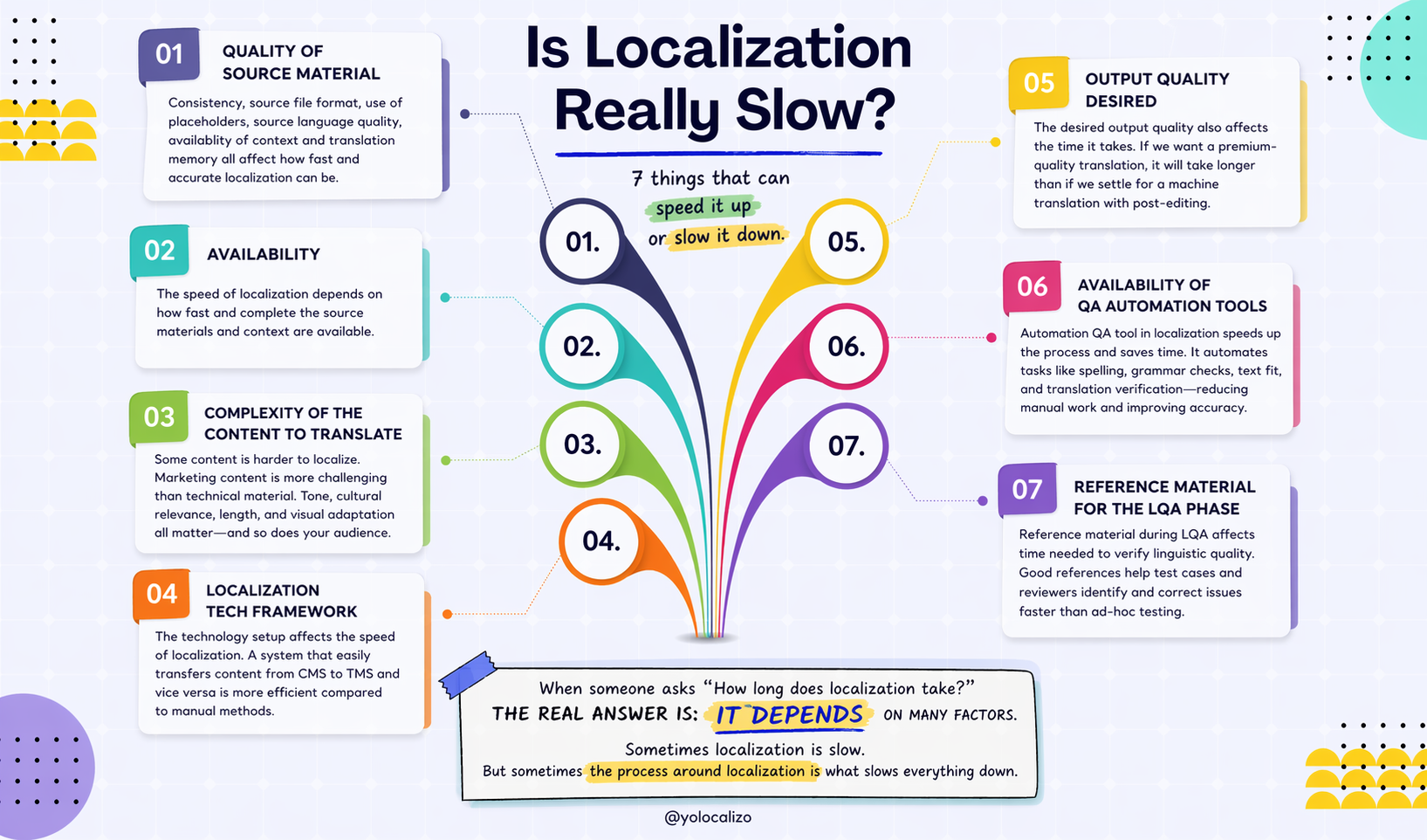


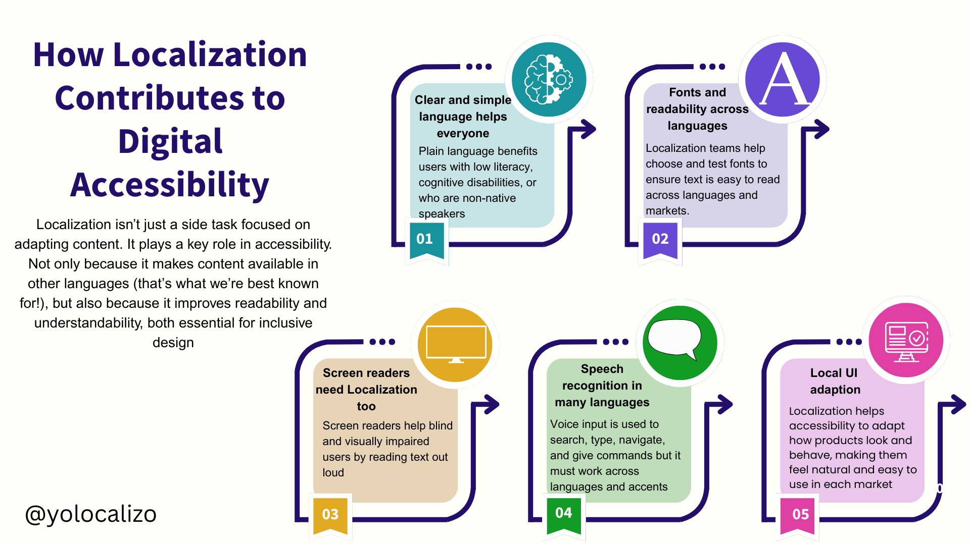
How Localization contributes to digital accessibility
May 15th is a special day for me for two reasons. First, as someone from Madrid, it’s the day of our city’s patron saint, San Isidro. So it always brings memories or a good excuse to celebrate, whether enjoying the San Isidro festival at the “pradera” or having a vermouth and some tapas around the Hortaleza district.
Second, it’s also a meaningful day in my profession. In Localization, we play a role in helping create inclusive products, and May 15th is Global Accessibility Awareness Day, a day to remind us how important it is to make digital products accessible for everyone.
More than one billion people in the world live with some disability or impairment permanently. Accessibility helps us use websites, apps, and games. But it also allows people who have temporary or situational challenges, for example, someone who broke their elbow while mountain biking and couldn’t use a keyboard or mobile with both hands for weeks 😅
When we think of accessible products, we usually think of input devices, low color contrast, adjustable audio speed, etc. And yes, many of today’s improvements in accessibility come from design and development. Localization also plays a part in creating accessible digital products.
What role does Localization play in making digital products more accessible?
Localization isn’t just a side task focused on adapting content. It actually plays a key role in accessibility. This is not only because it makes content available in other languages (that’s the part we’re best known for) but also because what we do, just to name two examples, helps to improve readability and understandability.
In the next few paragraphs, I’ll share examples of how Localization helps make digital products more accessible. You can use this list as a quick refresher or even as a checklist. It shows how you, as a localization professional, can contribute to building truly accessible products
Click HERE to download the image
1. Clear and simple language helps everyone
A big part of localization is adapting text for other languages. But there is another way we support accessibility: by making sure the original text is clear and easy to understand.
Why? Because long and complex sentences are hard to translate. They are also harder to understand, even in English. They take more mental effort, and that’s not good for accessibility.
So, one excellent way localization helps is by reviewing and improving the English source content. If we write it clearly and simply, the product becomes more accessible for everyone.
Plain language helps many people, such as those with low reading skills, those who speak English as a second language, and those with learning or thinking disabilities.
Siteimprove is a platform that helps organizations improve the quality, accessibility, and performance of their websites, and on their website, we can find 5 good tips for writing clearly:
Keep sentences under 20 words. Long sentences are more complex to follow. If you need a long sentence, use only one per paragraph.
Use short words when possible. Words with four or more syllables are harder to read. If you use them, try to keep the sentence short.
Avoid jargon. Unless your readers know it well, leave it out. Use simple words instead.
Use personal words. Say “we,” “you,” or “your” instead of long company names. This makes the text shorter and friendlier.
Add linking words. Use phrases like “overall,” “for example,” or “in fact” to help readers follow your ideas. These small words make a big difference.
2. Fonts and readability across languages
Fonts matter, and localization professionals play a key role in font integration. They help choose the right font for each market, during internationalization, or in the LQA phase to ensure readability.
Fonts affect how easily people can read on screen, so it’s one of the clear ways Localization supports accessibility.
Here are 5 good font practices for accessibility from Reciteme, a cloud-based web accessibility tool that helps make websites more inclusive
Use font sizes of 16px or larger
Make sure there’s good contrast between text and background
Avoid decorative fonts that are hard to read
Keep line length and spacing comfortable for the eyes
Adapt layout for right-to-left (RTL) languages like Arabic or Hebrew
And if you need some font recommendations, here I go with some ideas for you! Some of the most accessible fonts recommended include: Arial, Calibri, Century Gothic, Helvetica, Tahoma, and Verdana
3. Screen readers need Localization too
Screen readers are tools that read text out loud from the screen. They help people who are blind or visually impaired. Most screen readers only worked in English in the past, but that’s changed.
A great example is Google TalkBack, which allows visually impaired users to navigate mobile devices with voice prompts that read and describe what’s on screen.

Languages support in GoogleTalk
For screen readers to work well in many languages, localization teams need to translate all UI labels, ensure the correct reading order and tone, and write content that makes sense when read out loud
4. Speech recognition in many languages
More people now use voice to search, send messages, or move through apps. But these systems must recognize multiple languages and accents.
For example, voice input dictates text into form fields, navigates links, buttons, and other interactive elements, and issues spoken commands in different languages.
Localization professionals contribute by training voice input models for local languages, localizing voice command sets, and validating how accurately the system understands and responds in non-English environments.
This is useful for convenience and users with motor impairments, who may rely on voice to interact with software.
5. Local UI adaptation
Another way localization contributes to accessibility is by helping adapt how a product looks and behaves so it feels natural and easy to use in each market.
This is especially helpful for people with learning or reading difficulties, or anyone who might feel confused by unfamiliar layouts.
Here, localization helps in this aspect to support accessible content in apps:
Right-to-left support. Languages like Arabic are read from right to left, so the whole UI needs to flip: menus, buttons, images …everything. This makes the experience feel more natural.
Text alignment and spacing. Some languages (like many Asian languages) need more space than others (like Spanish, Italian, or French, to name a few closer to me). Localization teams spot and address these differences.
Icons and symbols. Not all icons mean the same thing everywhere. For example, a mailbox icon may not be understood globally. Localization teams help identify and replace unclear visuals.
Navigation and flow. People in different countries expect menus, forms, and buttons to appear in familiar places. Adjusting the flow helps everyone find their way around.
In conclusion…
Accessibility is a shared responsibility across all product development and design teams. When we consider accessibility from the start, we build products that reach more people, including those with disabilities.
Localization plays a big part in this. It helps reduce the distance between content and users. Localization is known for translation, but it goes way beyond that, and that’s why we can support the accessibility quest. Fonts, readability, screen reader compatibility, speech recognition, and UI adaptation are some areas where localization can make digital products more inclusive and accessible.
Let’s keep working together to build software that everyone can use.
It’s worth the effort.
@yolocalizo
Localization Managers are often expected to keep many stakeholders happy: leadership, content teams, linguists, product teams, regional teams, finance, and procurement. But maybe happiness is not the real goal. In this post, I reflect on why stakeholder alignment matters more, and how Localization can make expectations, hidden work, ownership, and trade-offs more visible