


Elements to consider when choosing our font - the connection between my flight delayed, jamón and time spent writing this post while waiting
Getting our flight delayed is something that although it is relatively normal, it's still very annoying; That happened to me the other day, my flight with departure from Madrid was delayed. But, hey when life gives you lemons, make lemonade! I went to eat ham tapas to make my wait easier 😜


There, in the “jamón” kiosk I was talking to Hector; Hector is an authentic professional of cutting ham, because cutting ham is an art! Observing Hector how he cut ham is like seeing a violinist play in flow mode The March from The Nutcracker!
Pure concentration and attention to detail. The way he cut the ham, each slice super thin, with great precision and care, was something that I found hypnotic to see. I told him that the care with which he placed the ham on the plate seemed worthy of admiration. And Hector told me something that I think is also applicable to apps and design in general. He told me "that food enters through the eyes"
And it is true, there are certain things that go to us first through the eyes, and that happens not only in the world of gastronomy but also how it could not be otherwise in the world of apps or Web environments.
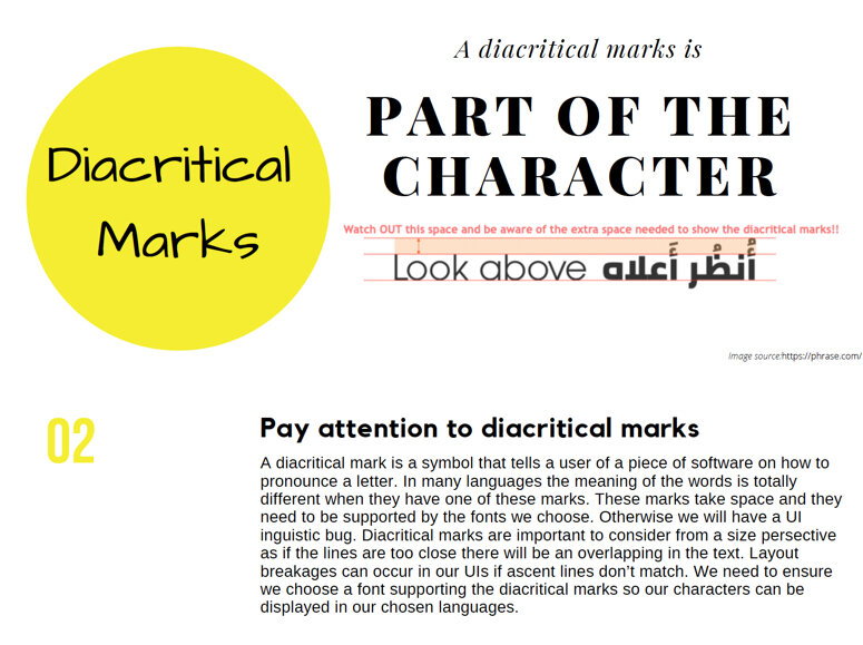
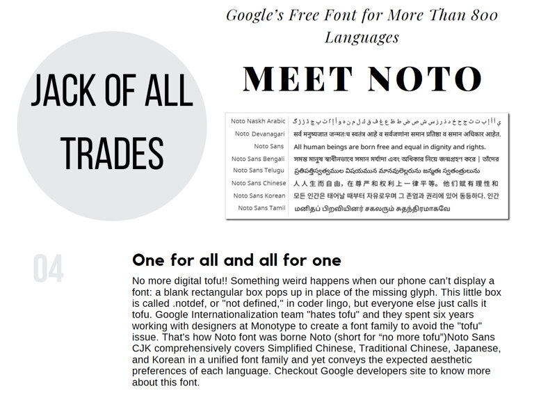
There is something clear, if you design an app or a game or a minimalist website, aesthetically precious, but then when I open the app in the German, Chinese or Thai language it is a disaster, with truncated texts, with characters that cannot be read well.... then we will have thrown away part of the reputation gained with that perfect version of our software in English.
Once again we must admit it.
If we want to launch a product that works globally, English is just one more language, what we must do to create truly global content is to pay attention to the globalization phase with the “weird” name, yes, yes, I mean Internationalization.
But in this post, I don't want to talk about the internationalization process itself, but about a sub-task that must be done while we internationalize our software.
Check out this blog post where I explain the in and outs of Internationalization
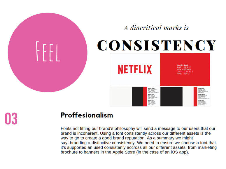
Although this sub-task seems like a minor step in the localization process, font choice can dramatically impact the layout and readability of our localized user interface and can also result in an inconsistent look and feel. To avoid picking the wrong font for our product, keep the following ideas in mind.
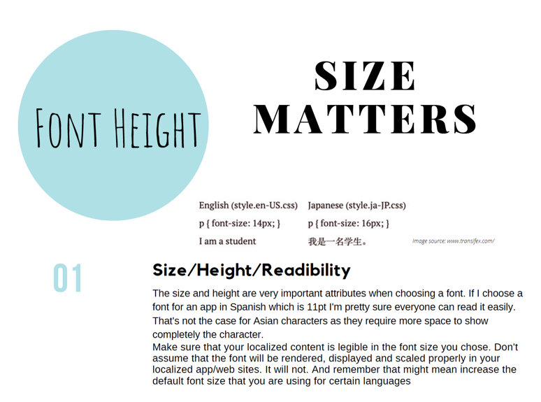
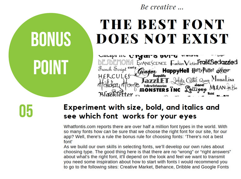
When considering fonts, the main difference between a good one and a bad one is legibility. A font selection might be an overwhelming experience but hopefully, these steps can make the font journey experience as great and as tasteful as enjoying the Jamon tapa that Hector crafted for me 😉
What’s your experience when choosing a font for your app or web page? What did you try that you think it’s useful? Please leave your comments below and have a great week ahead!
@yolocalizo


June is strategy season for many corporate teams. And for Localization, this usually means uncomfortable questions about budget, AI, workflows, markets, metrics, and business value. Before jumping into new tools or complex plans, maybe it is worth going back to the basics